AJ Quadrata
I saw the ashes flying. Dreams will be like a river of love. I think, therefore I write.

AJ Quadrata is a typeface distilled from Blackletter calligraphy, full of hardcore ligatures creating the intricate picket-fence pattern and rendering the script illegible to the modern layman. (Take a quiz!)
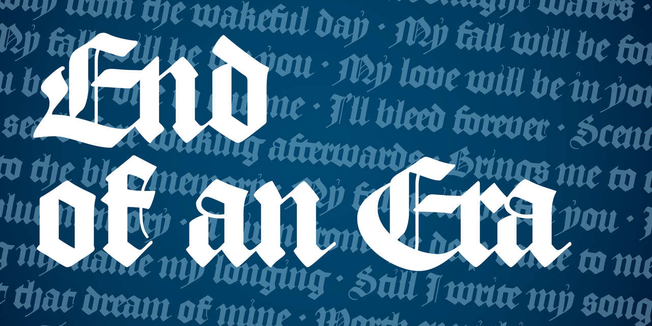

Blackletter scripts can be a really fun intro to calligraphy: there’s Fraktur, Schwabacher, Rotunda, Bastarda, but especially, Textura Quadrata. Made up of straight strokes and disciplined angles, it is especially demanding, but just as fascinating.
It requires constant planning and conscious effort to make the strokes meet where they’re supposed to. The letters often interact in ways unexpected to the modern eye. It is not just a script full of ligatures, but a script where every word is its own ligature, sometimes to the detriment of legibility. Textura can get nasty.
Even in the age of OpenType, most digital Blackletter typefaces (and they keep coming, in all shapes and sizes) only employ ligatures that were used in movable Blackletter type and that are found in modern usage (some nice exceptions: KPS Fonts).
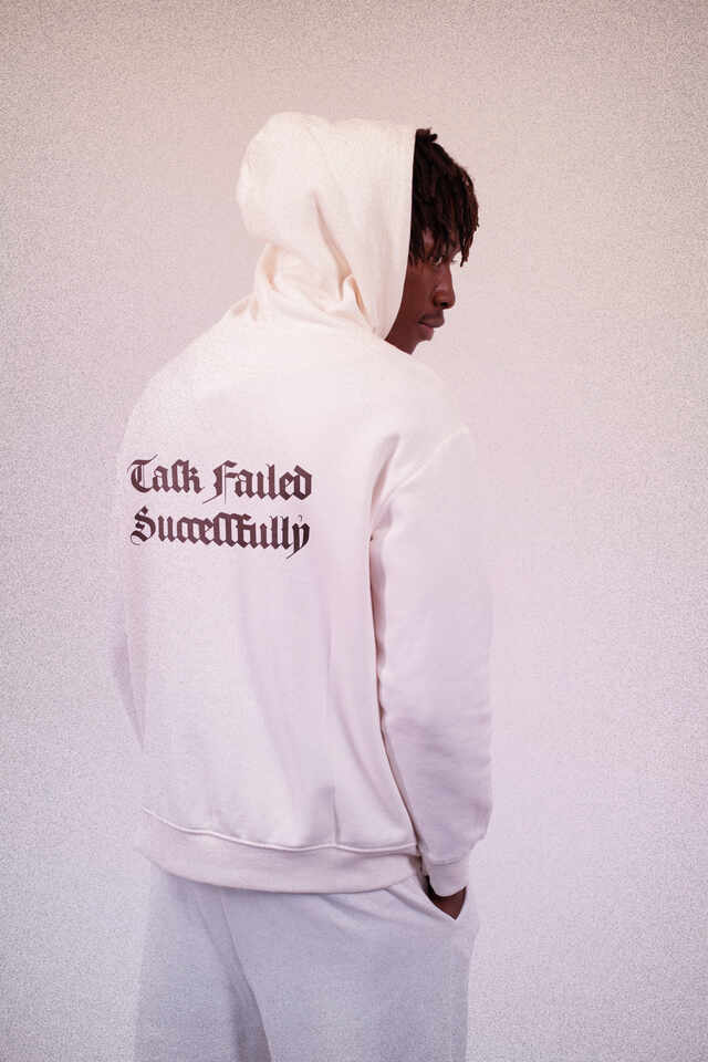
Against the current, I created a typeface based not on print, but Textura handwriting. It comes in two flavors: the default cut serves a reasonable ration of the archaic madness, and the worst bits were saved for AJ Quadrata Medieval.

In handwritten Textura, many letters collide with one another to form an unapologetic woven texture. A letter ‘violated’ this way may end up losing its diamond-shaped head serif.
These protruding letters (c, e, f, g, r, t, x) also form graceful ligatures with the arching hairline counter of the letter a.
Upon casting into metal, most letters were disentangled and only a few ligatures survived. To understand Textura’s essence and discover the richness of its combinations, you had to delve into the original calligraphic sources. Well, now you can also inspect AJ Quadrata.
A Blackletter tittle can have many forms. The naive approach is to make it a simple diamond following the ductus of the pen. But the actual sources typically employ either a diagonal hairline (not dissimilar to an acute accent) or a lazy hairline arc — as found in the Zwollen Bible, which AJ Quadrata is mostly based on. To preserve the tittle’s careless squiggly nature, I drew several variants contextually substituted in a pseudo-random fashion.
The tittle originally served as disambiguation and was only present above i adjacent to m, n, or u. This feature is preserved in AJ Quadrata Medieval. Ah yes, the y also comes with a squiggle. Given how rarely the letter is found in the sources, perhaps that was to disambiguate it from itself and from the crude reality?
Not all dots are created equal, and the squiggle doesn’t work so well as the dot diacritic mark. The diamond-shaped form which can be toggled with Stylistic Set 06 or by setting text language to Turkish, Kazakh, Crimean Tatar, Tatar or Azeri.
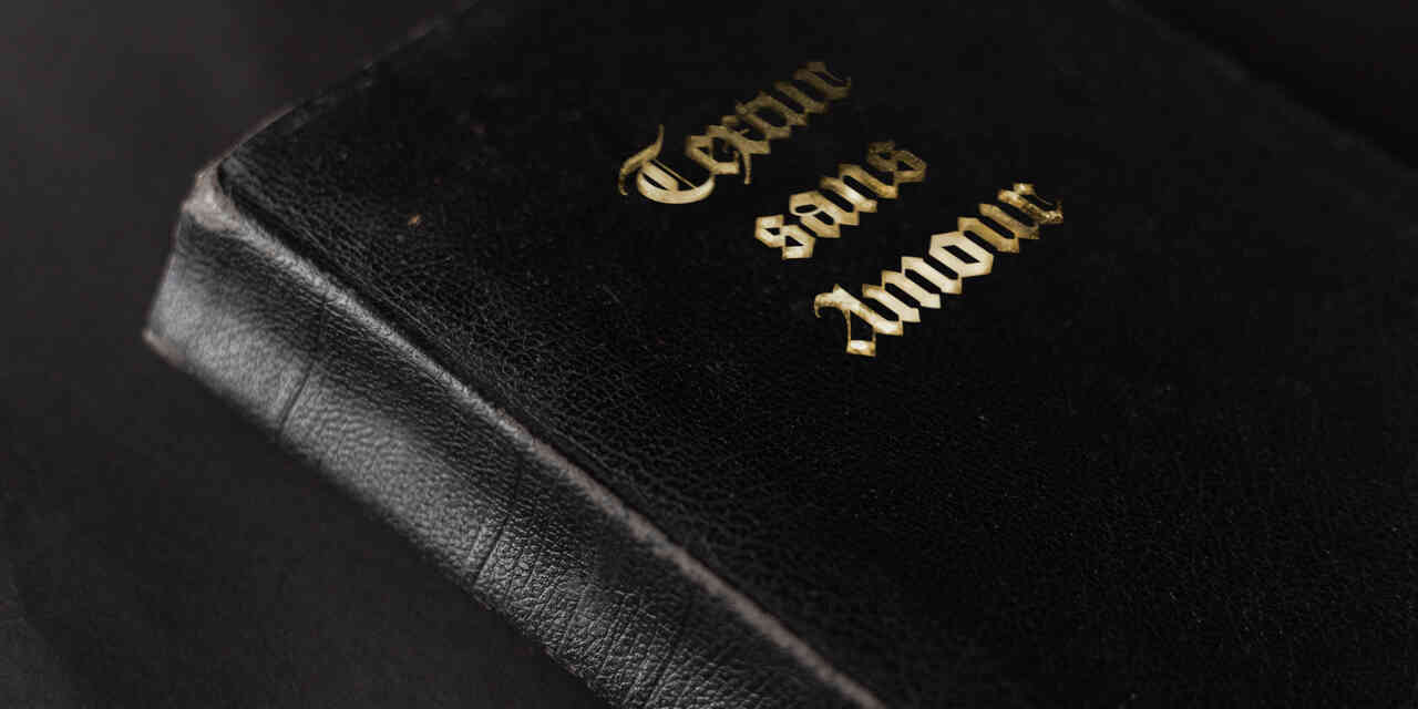
Black and red are the traditional colors of typography. Rubrication, from the Latin rubrīcāre, “to color red”, and ruber, “red”, is the process of adding red ink to emphasize paragraphs, headings, or initials. The last application is the most interesting on the font level. Blackletter capitals often feature red filling between two of their many strokes, or sometimes — as in the Zwollen Bible — a red overlay on a single stroke, which is what I went for in AJ Quadrata. That must have been some pretty opaque ink used there, though, essentially paint.
The rubrication is provided as a separate layer font, AJ Quadrata Rubrum. To use it, copy your text layer, paste in place, change the font to Rubrum and pick a color — a good start could be #DB1818.
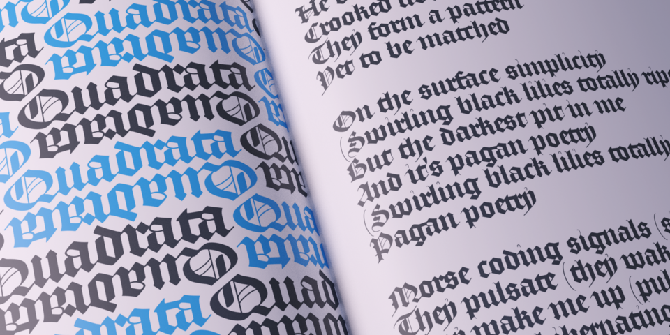
Find out how well you can read Textura by deciphering 15 words of increasing difficulty. If you get stuck, check some hints below.
The default cut of AJ Quadrata lets go of many cool (and awkward) aspects of the authentic Textura calligraphy. No worries though, most of these quirks found home in AJ Quadrata Medieval.